Arquivo da tag: Mapeamento digital

Ocean’s Largest Dead Zones Mapped by MIT Scientists (Eco Watch)

MIT scientists have generated an atlas of the world’s ocean dead zones.
Oxygen-deficient zones intensity across the eastern Pacific Ocean, where copper colors represent the locations of consistently lowest oxygen concentrations and deep teal indicates regions without sufficiently low dissolved oxygen. Jarek Kwiecinski and Andrew Babbin

By Olivia Rosane – Jan 26, 2022 12:11PM EST

When you think of the tropical Pacific, you might picture a rainbow of fish ribboning their way between pinnacles of coral, or large sea turtles swimming beneath diamonds of sunlight. But there are two mysterious zones in the Pacific Ocean where life like this cannot survive. 

That is because they are the two largest oxygen-deficient zones (ODZ) in the world, which means they are a no-go zone for most aerobic (oxygen-dependent) organisms. Two Massachusetts Institute of Technology (MIT) scientists recently succeeded in making the most detailed atlas to date of these important oceanic regions, revealing crucial new facts about them in the process. The new high-resolution atlas was described last month in the journal Global Biogeochemical Cycles

“We learned just how big these two zones in the Pacific are, reducing the uncertainty in the measurement, their horizontal extent, how much and where these zones are ventilated by oxygenated waters, and so much more,” Andrew Babbin told EcoWatch in an email. Babbin is one of the atlas’s two developers and Cecil and Ida Green Career Development Professor in MIT’s Department of Earth, Atmospheric and Planetary Sciences. “Being able to visualize in high resolution the low oxygen zones really is a necessary first step to fully understanding the processes and phenomena that lead to their emergence,” he said.

Natural Dead Zones

Oxygen-deficient zones can also be referred to as hypoxic zones or dead zones, as the National Oceanic and Atmospheric Administration explains. They can be caused by human activity, especially nutrient pollution. For example, the world’s second-largest dead zone is in the Gulf of Mexico, and is largely caused by the runoff of nitrogen and phosphorus from cities and factory farms.

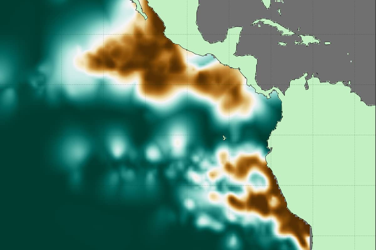
The new atlas focuses on two naturally-occurring ODZs in the tropical Pacific, however. One is located off the coast of South America and measures about 600,000 cubic kilometers (approximately 143,948 cubic miles), or the equivalent of 240-billion Olympic swimming pools, MIT News reported. The second is around three times larger and located in the northern hemisphere, off the coast of Central America. 

Both natural and anthropogenic ODZs have something in common: too many nutrients. In the case of the Pacific ODZs, Babbin said, those nutrients build up because of wind patterns that push water offshore. 

“Deeper water then upwells to fill in this void, bringing higher nutrients to the surface,” Babbin told EcoWatch. “Those nutrients stimulate a massive amount of growth of phytoplankton, akin to how we fertilize crop lands and even our potted plants at home. When those phytoplankton then sink, heterotrophic bacteria act to decompose the organic material, consuming oxygen just like humans do to respire our food.” 

However, because of where these zones are located, it takes a long time for oxygen-rich waters to reach the area and replenish what the bacteria gobble up.

“In essence, the biological demand of oxygen outpaces the physical resupply,” Babbin concluded. 

While these specific zones aren’t caused by human pollution, understanding them is still important in the context of human activity. ODZs can emit the greenhouse gas nitrous oxide, and there is a concern that the climate crisis may cause them to expand.

“It’s broadly expected that the oceans will lose oxygen as the climate gets warmer. But the situation is more complicated in the tropics where there are large oxygen-deficient zones,” atlas co-developer Jarek Kwiecinski told MIT News. “It’s important to create a detailed map of these zones so we have a point of comparison for future change.”

A ‘Leap Forward’ 

The new atlas improves on previous attempts to measure the Pacific ODZs because of the amount of information it incorporates and the approach it took to measuring the oxygen content of the water. Instead of relying on direct measurements of the water’s oxygen content, the atlas designers looked for places in the water where the oxygen content did not change no matter the depth. They interpreted the lack of change as an absence of oxygen.

“This new approach, compiling tens of thousands of profiles and over 15 million individual measurements, is a leap forward in the representation of these climate critical regions,” Babbin and Kwiecinski wrote in Global Biogeochemical Cycles. 

The data Babbin and Kwiecinski used for the atlas was gathered by research cruisers and robotic floats over a period of more than 40 years, MIT News reported. Scientists have typically dropped bottles to various depths and measured the oxygen content of the water collected by the bottle. However, this measurement is not entirely accurate because the plastic from the bottle itself also contains oxygen. 

To avoid this problem, the team behind the atlas instead looked at data from sensors attached to the bottles or to robotic platforms, which allowed them to track oxygen content as the sensors descended through the water column. 

“This method then allows us to get around a bias that exists in the absolute data to only look at whether oxygen is increasing, decreasing, or staying the same,” Babbin said.

The result is a high-resolution atlas that maps the volume, shape and borders of the two ODZs, as well as places where the oxygen-deprived waters are thicker or thinner. They found that the lack of oxygen is more concentrated towards the middle, while more oxygen-rich waters enter towards the edges. 

Now that the atlas is complete, Babbin hopes to use it to plan more research in the area. Specifically, he intends to study the metabolism of the bacteria in the zones in order to better assess nitrous oxide pollution. But the atlas was not just designed to further one team’s research. 

“We hope the atlas will be used by everyone!” Babbin said. “We can anticipate oceanographers and climate scientists to use it to plan expeditions or relate some of their data to a broad atlas/compilation. We hope climate modelers might use it to validate their models that try to reproduce the extent of low oxygen in their models. We further think that this compilation will act as a comparison point against which future measurements can be compared to finally reveal how these zones respond in the face of a changing climate.”

If you are interested in checking it out, the atlas is available from the Biological and Chemical Oceanography Data Management Office (BCO-DMO), and the data can be downloaded from the Woods Hole Open Access Server.

Correction: A previous version of this article incorrectly stated that anaerobic organisms were oxygen-dependent. Aerobic organisms are oxygen-dependent. This page has been updated.

Soon, satellites will be able to watch you everywhere all the time (MIT Technology Review)

Can privacy survive?

Christopher Beam

June 26, 2019


In 2013, police in Grants Pass, Oregon, got a tip that a man named Curtis W. Croft had been illegally growing marijuana in his backyard. So they checked Google Earth. Indeed, the four-month-old satellite image showed neat rows of plants growing on Croft’s property. The cops raided his place and seized 94 plants.

In 2018, Brazilian police in the state of Amapá used real-time satellite imagery to detect a spot where trees had been ripped out of the ground. When they showed up, they discovered that the site was being used to illegally produce charcoal, and arrested eight people in connection with the scheme.

Chinese government officials have denied or downplayed the existence of Uighur reeducation camps in Xinjiang province, portraying them as “vocational schools.” But human rights activists have used satellite imagery to show that many of the “schools” are surrounded by watchtowers and razor wire.

Every year, commercially available satellite images are becoming sharper and taken more frequently. In 2008, there were 150 Earth observation satellites in orbit; by now there are 768. Satellite companies don’t offer 24-hour real-time surveillance, but if the hype is to be believed, they’re getting close. Privacy advocates warn that innovation in satellite imagery is outpacing the US government’s (to say nothing of the rest of the world’s) ability to regulate the technology. Unless we impose stricter limits now, they say, one day everyone from ad companies to suspicious spouses to terrorist organizations will have access to tools previously reserved for government spy agencies. Which would mean that at any given moment, anyone could be watching anyone else.

The images keep getting clearer

Commercial satellite imagery is currently in a sweet spot: powerful enough to see a car, but not enough to tell the make and model; collected frequently enough for a farmer to keep tabs on crops’ health, but not so often that people could track the comings and goings of a neighbor. This anonymity is deliberate. US federal regulations limit images taken by commercial satellites to a resolution of 25 centimeters, or about the length of a man’s shoe. (Military spy satellites can capture images far more granular, although just how much more is classified.)

Ever since 2014, when the National Oceanic and Atmospheric Administration (NOAA) relaxed the limit from 50 to 25 cm, that resolution has been fine enough to satisfy most customers. Investors can predict oil supply from the shadows cast inside oil storage tanks. Farmers can monitor flooding to protect their crops. Human rights organizations have tracked the flows of refugees from Myanmar and Syria.

But satellite imagery is improving in a way that investors and businesses will inevitably want to exploit. The imaging company Planet Labs currently maintains 140 satellites, enough to pass over every place on Earth once a day. Maxar, formerly DigitalGlobe, which launched the first commercial Earth observation satellite in 1997, is building a constellation that will be able to revisit spots 15 times a day. BlackSky Global promises to revisit most major cities up to 70 times a day. That might not be enough to track an individual’s every move, but it would show what times of day someone’s car is typically in the driveway, for instance.

Some companies are even offering live video from space. As early as 2014, a Silicon Valley startup called SkyBox (later renamed Terra Bella and purchased by Google and then Planet) began touting HD video clips up to 90 seconds long. And a company called EarthNow says it will offer “continuous real-time” monitoring “with a delay as short as about one second,” though some think it is overstating its abilities. Everyone is trying to get closer to a “living map,” says Charlie Loyd of Mapbox, which creates custom maps for companies like Snapchat and the Weather Channel. But it won’t arrive tomorrow, or the next day: “We’re an extremely long way from high-res, full-time video of the Earth.”

Some of the most radical developments in Earth observation involve not traditional photography but rather radar sensing and hyperspectral images, which capture electromagnetic wavelengths outside the visible spectrum. Clouds can hide the ground in visible light, but satellites can penetrate them using synthetic aperture radar, which emits a signal that bounces off the sensed object and back to the satellite. It can determine the height of an object down to a millimeter. NASA has used synthetic aperture radar since the 1970s, but the fact that the US approved it for commercial use only last year is testament to its power—and political sensitivity. (In 1978, military officials supposedly blocked the release of radar satellite images that revealed the location of American nuclear submarines.)

While GPS data from cell phones is a legitimate privacy threat, you can at least decide to leave your phone at home. It’s harder to hide from a satellite camera.

Meanwhile, farmers can use hyperspectral sensing to tell where a crop is in its growth cycle, and geologists can use it to detect the texture of rock that might be favorable to excavation. But it could also be used, whether by military agencies or terrorists, to identify underground bunkers or nuclear materials. 

The resolution of commercially available imagery, too, is likely to improve further. NOAA’s 25-centimeter cap will come under pressure as competition from international satellite companies increases. And even if it doesn’t, there’s nothing to stop, say, a Chinese company from capturing and selling 10 cm images to American customers. “Other companies internationally are going to start providing higher-­resolution imagery than we legally allow,” says Therese Jones, senior director of policy for the Satellite Industry Association. “Our companies would want to push the limit down as far as they possibly could.”

What will make the imagery even more powerful is the ability to process it in large quantities. Analytics companies like Orbital Insight and SpaceKnow feed visual data into algorithms designed to let anyone with an internet connection understand the pictures en masse. Investors use this analysis to, for example, estimate the true GDP of China’s Guangdong province on the basis of the light it emits at night. But burglars could also scan a city to determine which families are out of town most often and for how long.

Satellite and analytics companies say they’re careful to anonymize their data, scrubbing it of identifying characteristics. But even if satellites aren’t recognizing faces, those images combined with other data streams—GPS, security cameras, social-media posts—could pose a threat to privacy. “People’s movements, what kinds of shops do you go to, where do your kids go to school, what kind of religious institutions do you visit, what are your social patterns,” says Peter Martinez, of the Secure World Foundation. “All of these kinds of questions could in principle be interrogated, should someone be interested.”

Like all tools, satellite imagery is subject to misuse. Its apparent objectivity can lead to false conclusions, as when the George W. Bush administration used it to make the case that Saddam Hussein was stockpiling chemical weapons in Iraq. Attempts to protect privacy can also backfire: in 2018, a Russian mapping firm blurred out the sites of sensitive military operations in Turkey and Israel—inadvertently revealing their existence, and prompting web users to locate the sites on other open-source maps.

Capturing satellite imagery with good intentions can have unintended consequences too. In 2012, as conflict raged on the border between Sudan and South Sudan, the Harvard-based Satellite Sentinel Project released an image that showed a construction crew building a tank-capable road leading toward an area occupied by the Sudanese People’s Liberation Army. The idea was to warn citizens about the approaching tanks so they could evacuate. But the SPLA saw the images too, and within 36 hours it attacked the road crew (which turned out to consist of Chinese civilians hired by the Sudanese government), killed some of them, and kidnapped the rest. As an activist, one’s instinct is often to release more information, says Nathaniel Raymond, a human rights expert who led the Sentinel project. But he’s learned that you have to take into account who else might be watching.

It’s expensive to watch you all the time

One thing that might save us from celestial scrutiny is the price. Some satellite entrepreneurs argue that there isn’t enough demand to pay for a constellation of satellites capable of round-the-clock monitoring at resolutions below 25 cm. “It becomes a question of economics,” says Walter Scott, founder of DigitalGlobe, now Maxar. While some companies are launching relatively cheap “nanosatellites” the size of toasters—the 120 Dove satellites launched by Planet, for example, are “orders of magnitude” cheaper than traditional satellites, according to a spokesperson—there’s a limit to how small they can get and still capture hyper-detailed images. “It is a fundamental fact of physics that aperture size determines the limit on the resolution you can get,” says Scott. “At a given altitude, you need a certain size telescope.” That is, in Maxar’s case, an aperture of about a meter across, mounted on a satellite the size of a small school bus. (While there are ways around this limit—interferometry, for example, uses multiple mirrors to simulate a much larger mirror—they’re complex and pricey.) Bigger satellites mean costlier launches, so companies would need a financial incentive to collect such granular data.

That said, there’s already demand for imagery with sub–25 cm resolution—and a supply of it. For example, some insurance underwriters need that level of detail to spot trees overhanging a roof, or to distinguish a skylight from a solar panel, and they can get it from airplanes and drones. But if the cost of satellite images came down far enough, insurance companies would presumably switch over.

Of course, drones can already collect better images than satellites ever will. But drones are limited in where they can go. In the US, the Federal Aviation Administration forbids flying commercial drones over groups of people, and you have to register a drone that weighs more than half a pound (227 grams) or so. There are no such restrictions in space. The Outer Space Treaty, signed in 1967 by the US, the Soviet Union, and dozens of UN member states, gives all states free access to space, and subsequent agreements on remote sensing have enshrined the principle of “open skies.” During the Cold War this made sense, as it allowed superpowers to monitor other countries to verify that they were sticking to arms agreements. But the treaty didn’t anticipate that it would one day be possible for anyone to get detailed images of almost any location.

And then there are the tracking devices we carry around in our pockets, a.k.a. smartphones. But while the GPS data from cell  phones is a legitimate privacy threat, you can at least decide to leave your phone at home. It’s harder to hide from a satellite camera. “There’s some element of ground truth—no pun intended—that satellites have that maybe your cell phone or digital record or what happens on Twitter [doesn’t],” says Abraham Thomas, chief data officer at the analytics company Quandl. “The data itself tends to be innately more accurate.”

The future of human freedom

American privacy laws are vague when it comes to satellites. Courts have generally allowed aerial surveillance, though in 2015 the New Mexico Supreme Court ruled that an “aerial search” by police without a warrant was unconstitutional. Cases often come down to whether an act of surveillance violates someone’s “reasonable expectation of privacy.” A picture taken on a public sidewalk: fair game. A photo shot by a drone through someone’s bedroom window: probably not. A satellite orbiting hundreds of miles up, capturing video of a car pulling into the driveway? Unclear.

That doesn’t mean the US government is powerless. It has no jurisdiction over Chinese or Russian satellites, but it can regulate how American customers use foreign imagery. If US companies are profiting from it in a way that violates the privacy of US citizens, the government could step in.

Raymond argues that protecting ourselves will mean rethinking privacy itself. Current privacy laws, he says, focus on threats to the rights of individuals. But those protections “are anachronistic in the face of AI, geospatial technologies, and mobile technologies, which not only use group data, they run on group data as gas in the tank,” Raymond says. Regulating these technologies will mean conceiving of privacy as applying not just to individuals, but to groups as well. “You can be entirely ethical about personally identifiable information and still kill people,” he says.

Until we can all agree on data privacy norms, Raymond says, it will be hard to create lasting rules around satellite imagery. “We’re all trying to figure this out,” he says. “It’s not like anything’s riding on it except the future of human freedom.”

Christopher Beam is a writer based in Los Angeles.

The space issue

This story was part of our July 2019 issue

How big science failed to unlock the mysteries of the human brain (MIT Technology Review)

technologyreview.com

Large, expensive efforts to map the brain started a decade ago but have largely fallen short. It’s a good reminder of just how complex this organ is.

Emily Mullin

August 25, 2021


In September 2011, a group of neuroscientists and nanoscientists gathered at a picturesque estate in the English countryside for a symposium meant to bring their two fields together. 

At the meeting, Columbia University neurobiologist Rafael Yuste and Harvard geneticist George Church made a not-so-modest proposal: to map the activity of the entire human brain at the level of individual neurons and detail how those cells form circuits. That knowledge could be harnessed to treat brain disorders like Alzheimer’s, autism, schizophrenia, depression, and traumatic brain injury. And it would help answer one of the great questions of science: How does the brain bring about consciousness? 

Yuste, Church, and their colleagues drafted a proposal that would later be published in the journal Neuron. Their ambition was extreme: “a large-scale, international public effort, the Brain Activity Map Project, aimed at reconstructing the full record of neural activity across complete neural circuits.” Like the Human Genome Project a decade earlier, they wrote, the brain project would lead to “entirely new industries and commercial ventures.” 

New technologies would be needed to achieve that goal, and that’s where the nanoscientists came in. At the time, researchers could record activity from just a few hundred neurons at once—but with around 86 billion neurons in the human brain, it was akin to “watching a TV one pixel at a time,” Yuste recalled in 2017. The researchers proposed tools to measure “every spike from every neuron” in an attempt to understand how the firing of these neurons produced complex thoughts. 

The audacious proposal intrigued the Obama administration and laid the foundation for the multi-year Brain Research through Advancing Innovative Neurotechnologies (BRAIN) Initiative, announced in April 2013. President Obama called it the “next great American project.” 

But it wasn’t the first audacious brain venture. In fact, a few years earlier, Henry Markram, a neuroscientist at the École Polytechnique Fédérale de Lausanne in Switzerland, had set an even loftier goal: to make a computer simulation of a living human brain. Markram wanted to build a fully digital, three-dimensional model at the resolution of the individual cell, tracing all of those cells’ many connections. “We can do it within 10 years,” he boasted during a 2009 TED talk

In January 2013, a few months before the American project was announced, the EU awarded Markram $1.3 billion to build his brain model. The US and EU projects sparked similar large-scale research efforts in countries including Japan, Australia, Canada, China, South Korea, and Israel. A new era of neuroscience had begun. 

An impossible dream?

A decade later, the US project is winding down, and the EU project faces its deadline to build a digital brain. So how did it go? Have we begun to unwrap the secrets of the human brain? Or have we spent a decade and billions of dollars chasing a vision that remains as elusive as ever? 

From the beginning, both projects had critics.

EU scientists worried about the costs of the Markram scheme and thought it would squeeze out other neuroscience research. And even at the original 2011 meeting in which Yuste and Church presented their ambitious vision, many of their colleagues argued it simply wasn’t possible to map the complex firings of billions of human neurons. Others said it was feasible but would cost too much money and generate more data than researchers would know what to do with. 

In a blistering article appearing in Scientific American in 2013, Partha Mitra, a neuroscientist at the Cold Spring Harbor Laboratory, warned against the “irrational exuberance” behind the Brain Activity Map and questioned whether its overall goal was meaningful. 

Even if it were possible to record all spikes from all neurons at once, he argued, a brain doesn’t exist in isolation: in order to properly connect the dots, you’d need to simultaneously record external stimuli that the brain is exposed to, as well as the behavior of the organism. And he reasoned that we need to understand the brain at a macroscopic level before trying to decode what the firings of individual neurons mean.  

Others had concerns about the impact of centralizing control over these fields. Cornelia Bargmann, a neuroscientist at Rockefeller University, worried that it would crowd out research spearheaded by individual investigators. (Bargmann was soon tapped to co-lead the BRAIN Initiative’s working group.)

There isn’t a single, agreed-upon theory of how the brain works, and not everyone in the field agreed that building a simulated brain was the best way to study it.

While the US initiative sought input from scientists to guide its direction, the EU project was decidedly more top-down, with Markram at the helm. But as Noah Hutton documents in his 2020 film In Silico, Markram’s grand plans soon unraveled. As an undergraduate studying neuroscience, Hutton had been assigned to read Markram’s papers and was impressed by his proposal to simulate the human brain; when he started making documentary films, he decided to chronicle the effort. He soon realized, however, that the billion-dollar enterprise was characterized more by infighting and shifting goals than by breakthrough science.

In Silico shows Markram as a charismatic leader who needed to make bold claims about the future of neuroscience to attract the funding to carry out his particular vision. But the project was troubled from the outset by a major issue: there isn’t a single, agreed-upon theory of how the brain works, and not everyone in the field agreed that building a simulated brain was the best way to study it. It didn’t take long for those differences to arise in the EU project. 

In 2014, hundreds of experts across Europe penned a letter citing concerns about oversight, funding mechanisms, and transparency in the Human Brain Project. The scientists felt Markram’s aim was premature and too narrow and would exclude funding for researchers who sought other ways to study the brain. 

“What struck me was, if he was successful and turned it on and the simulated brain worked, what have you learned?” Terry Sejnowski, a computational neuroscientist at the Salk Institute who served on the advisory committee for the BRAIN Initiative, told me. “The simulation is just as complicated as the brain.” 

The Human Brain Project’s board of directors voted to change its organization and leadership in early 2015, replacing a three-member executive committee led by Markram with a 22-member governing board. Christoph Ebell, a Swiss entrepreneur with a background in science diplomacy, was appointed executive director. “When I took over, the project was at a crisis point,” he says. “People were openly wondering if the project was going to go forward.”

But a few years later he was out too, after a “strategic disagreement” with the project’s host institution. The project is now focused on providing a new computational research infrastructure to help neuroscientists store, process, and analyze large amounts of data—unsystematic data collection has been an issue for the field—and develop 3D brain atlases and software for creating simulations.

The US BRAIN Initiative, meanwhile, underwent its own changes. Early on, in 2014, responding to the concerns of scientists and acknowledging the limits of what was possible, it evolved into something more pragmatic, focusing on developing technologies to probe the brain. 

New day

Those changes have finally started to produce results—even if they weren’t the ones that the founders of each of the large brain projects had originally envisaged. 

Last year, the Human Brain Project released a 3D digital map that integrates different aspects of human brain organization at the millimeter and micrometer level. It’s essentially a Google Earth for the brain. 

And earlier this year Alipasha Vaziri, a neuroscientist funded by the BRAIN Initiative, and his team at Rockefeller University reported in a preprint paper that they’d simultaneously recorded the activity of more than a million neurons across the mouse cortex. It’s the largest recording of animal cortical activity yet made, if far from listening to all 86 billion neurons in the human brain as the original Brain Activity Map hoped.

The US effort has also shown some progress in its attempt to build new tools to study the brain. It has speeded the development of optogenetics, an approach that uses light to control neurons, and its funding has led to new high-density silicon electrodes capable of recording from hundreds of neurons simultaneously. And it has arguably accelerated the development of single-cell sequencing. In September, researchers using these advances will publish a detailed classification of cell types in the mouse and human motor cortexes—the biggest single output from the BRAIN Initiative to date.

While these are all important steps forward, though, they’re far from the initial grand ambitions. 

Lasting legacy

We are now heading into the last phase of these projects—the EU effort will conclude in 2023, while the US initiative is expected to have funding through 2026. What happens in these next years will determine just how much impact they’ll have on the field of neuroscience.

When I asked Ebell what he sees as the biggest accomplishment of the Human Brain Project, he didn’t name any one scientific achievement. Instead, he pointed to EBRAINS, a platform launched in April of this year to help neuroscientists work with neurological data, perform modeling, and simulate brain function. It offers researchers a wide range of data and connects many of the most advanced European lab facilities, supercomputing centers, clinics, and technology hubs in one system. 

“If you ask me ‘Are you happy with how it turned out?’ I would say yes,” Ebell said. “Has it led to the breakthroughs that some have expected in terms of gaining a completely new understanding of the brain? Perhaps not.” 

Katrin Amunts, a neuroscientist at the University of Düsseldorf, who has been the Human Brain Project’s scientific research director since 2016, says that while Markram’s dream of simulating the human brain hasn’t been realized yet, it is getting closer. “We will use the last three years to make such simulations happen,” she says. But it won’t be a big, single model—instead, several simulation approaches will be needed to understand the brain in all its complexity. 

Meanwhile, the BRAIN Initiative has provided more than 900 grants to researchers so far, totaling around $2 billion. The National Institutes of Health is projected to spend nearly $6 billion on the project by the time it concludes. 

For the final phase of the BRAIN Initiative, scientists will attempt to understand how brain circuits work by diagramming connected neurons. But claims for what can be achieved are far more restrained than in the project’s early days. The researchers now realize that understanding the brain will be an ongoing task—it’s not something that can be finalized by a project’s deadline, even if that project meets its specific goals.

“With a brand-new tool or a fabulous new microscope, you know when you’ve got it. If you’re talking about understanding how a piece of the brain works or how the brain actually does a task, it’s much more difficult to know what success is,” says Eve Marder, a neuroscientist at Brandeis University. “And success for one person would be just the beginning of the story for another person.” 

Yuste and his colleagues were right that new tools and techniques would be needed to study the brain in a more meaningful way. Now, scientists will have to figure out how to use them. But instead of answering the question of consciousness, developing these methods has, if anything, only opened up more questions about the brain—and shown just how complex it is. 

“I have to be honest,” says Yuste. “We had higher hopes.”

Emily Mullin is a freelance journalist based in Pittsburgh who focuses on biotechnology.

Circulação para trabalho explica concentração de casos de Covid-19 (UOL/Blog Raquel Rolnik)

raquelrolnik.blogosfera.uol.com.br

Raquel Rolnik 30/06/2020 19h09

Por Aluizio Marino², Danielle Klintowitz³, Gisele Brito², Raquel Rolnik¹, Paula Santoro¹, Pedro Mendonça²

Foto: Roberto Moreyra (Agência O Globo)

Desde o início da pandemia no Brasil muito tem se debatido acerca dos impactos nos diferentes territórios e segmentos sociais. Algo fundamental tanto para encontrar os melhores meios de prevenir a difusão da doença como de proteger aqueles que estão mais vulneráveis. Entretanto, a forma como as informações e os dados têm sido divulgados não auxilia na análise dos impactos territoriais e da difusão espacial da pandemia, dificultando também o seu devido enfrentamento.

Na cidade de São Paulo, a escala de análise da pandemia ainda são os distritos, que correspondem a porções enormes do território e com população maior do que muitas cidades de porte médio. Essa visão simplificadora ignora as heterogeneidades e desigualdades territoriais existentes na cidade. Conforme apontamos anteriormente, infelizmente a dimensão territorial não é considerada de forma adequada, prevalecendo uma leitura simplificada e, até mesmo, estigmatizada, como por exemplo quando se afirma “onde tem favela tem pandemia”.

Em artigo anterior, apresentamos o resultado de pesquisa em outra escala, a da rua. Para tanto, mapeamos as hospitalizações e óbitos pós internação por Covid-19 a partir do CEP – informação fornecida nas fichas dos pacientes hospitalizados com Síndrome Respiratória Aguda e Grave (SRAG) incluindo Covid-19 e disponibilizadas pelo DATASUS até aquele momento (18 de maio de 2020). Esse procedimento permitiu olhar mais detalhadamente para a distribuição territorial da pandemia, e assim evidenciar a complexidade de questões que explicam a sua difusão espacial, não apenas a precariedade habitacional e a presença de favelas.

A partir desta constatação passamos a investigar outros possíveis elementos explicativos, entre eles, a mobilidade urbana durante o período da pandemia, especificamente compreendendo o fluxo de circulação das pessoas na cidade e como isso influencia na difusão espacial da Covid-19. Com base nos dados disponibilizados pela SPTrans sobre dados de GPS dos ônibus, e a partir do roteamento de viagens selecionadas da Pesquisa Origem Destino de 2017, buscamos identificar de onde saíram e para onde foram as pessoas que circularam de transporte coletivo no dia 5 de junho, dia em que, segundo a SPTrans, cerca de 3 milhões de viagens foram realizadas usando os ônibus municipais.
Ao mesmo tempo, fizemos uma leitura territorial sobre a origem das viagens durante o período de pandemia. Para esta análise identificou-se na Pesquisa Origem Destino (2017) as pessoas que usam transporte público como modo principal para chegar ao seu destino, motivadas pela ida ao local de trabalho. Consideramos apenas as viagens realizadas por pessoas sem ensino superior e em cargos não executivos. Esse perfil foi selecionado considerando que pessoas com ensino superior, em cargos executivos e profissionais liberais tenham aderido ao teletrabalho e que viagens com outras motivações, como educação e compras, pararam de ocorrer. Esses dados de mobilidade foram correlacionados com os dados de hospitalizações por SRAG não identificada, e Covid-19, até o dia 18 de maio, última data para qual o dado do CEP no DATASUS estava disponibilizado pelo Ministério da Saúde.

Desta forma produzimos um mapa que ilustra a distribuição dos lugares de origem das viagens diárias, a partir de uma distribuição que considera número de viagens nas zonas origem-destino e distribuição populacional dentro dessas zonas. O resultado mostra uma forte associação entre os locais que mais concentraram as origens das viagens com as manchas de concentração do local de residência de pessoas hospitalizadas com Covid-19 e Síndrome Respiratória Grave (SRAG) sem identificação, possivelmente casos de Covid-19, mas que não foram testados ou não tiveram resultado confirmado.

Mapa: Pedro Mendonça/ LabCidade

Com base neste estudo, pode-se dizer que, em síntese, quem está sendo mais atingido pela Covid-19 são as pessoas que tiveram que sair para trabalhar. Embora tenhamos mapeado os locais que concentram os maiores números de origens ou destinos dos fluxos de circulação por transporte coletivo, não é possível ainda afirmar se o contágio ocorreu no percurso do transporte, no local de trabalho ou no local de moradia, o que vai exigir análises futuras, que serão realizadas no âmbito desta pesquisa. Mas o que está evidente é que quem saiu para trabalhar e realizou percursos longos de transporte coletivo é que quem foi mais impactado pelos óbitos ocorridos. Enquanto esse fator mostrou associação forte com os casos de hospitalizações por SRAG não identificada e Covid-19, a densidade demográfica — frequentemente associada a áreas favelizadas e bairros populares — apresentou associação fraca.

Ainda que preliminares, esses dados apontam para a incoerência e inconsequência da abertura planejada pelas prefeituras e governo do estado. A reabertura de comércios e restaurantes implica em aumentar significativamente o número de áreas de origens com mais densidades de viagens e maior circulação de pessoas no transporte público. Se o maior número de óbitos está nos territórios que tiveram mais pessoas saindo para trabalhar durante o período de isolamento, temos que pensar tanto em políticas que as protejam em seus percursos como ampliar o direito ao isolamento paras as pessoas que não estão envolvidas com serviços essenciais mais precisam trabalhar para garantir seu sustento, o que reforça a importância de políticas de garantia de renda e segurança alimentar, subsídios de aluguel e outras despesas, e ações articuladas a coletivos e organizações locais para a proteção dos que mais estão ameaçados durante a pandemia.

Embora esses dados sejam públicos, nos parece que estão sendo ignorados para a definição de estratégias de enfrentamento a pandemia. É urgente repensar a forma como a política de mobilidade na cidade tem sido pensada, já que foram cometidos equívocos tal como o mega rodízio para veículos individuais, que durou apenas alguns dias e provocou uma superlotação nos transportes públicos ampliando os riscos das pessoas que precisavam sair para trabalhar. Ainda não foram implementadas medidas que garantam condições seguras para que as pessoas dos serviços essenciais pudessem fazer as viagens necessárias para exercer seus trabalhos sem ampliar a difusão da infecção do coronavírus. Bem como não existe uma leitura sobre a mobilidade metropolitana — inclusive não existem dados abertos sobre isso — ignorando as dinâmicas pendulares de pessoas que moram e trabalham em municípios diferentes da região metropolitana.

¹ Coordenadoras do LabCidade e professoras da Faculdade de Arquitetura e Urbanismo (FAU) da USP
² Pesquisadores do LabCidade
³ Pesquisadora do Instituto Pólis

UN-Habitat data mapping ensures assistance reaches the most vulnerable in Brazil’s slums (ReliefWeb)

UN-HABITAT

3 Jun 2020

Rio de Janeiro, Brazil, June 2020 – Some 2,500 vulnerable and sick older people living in the slums of Brazil’s largest city, received hygiene kits to support them during the COVID-19 pandemic. The Social Territories Programme, implemented by the City of Rio de Janeiro, with the support of UN-Habitat, organized the distribution of the kits in 10 informal settlements known as favelas.

The kits, which include sanitizer, liquid soap, deodorant, shampoo and toothbrushes, donated by UNICEF, the United Nations Children’s Fund, were given to older vulnerable people, those who are bedridden and with heart problems in Alemão, Maré, Chapadão, Pedreira ,Vila Kennedy, Lins, Penha, Cidade de Deus, Jacarezinho and Rocinha. The materials were distributed alongside food baskets of staple goods.

The delivery and distribution was supported by professionals from the health department of the municipality of Rio de Janeiro. The selection of those eligible to receive assistance was made using data produced under the Social Territories Programme during which UN-Habitat Brazil has organized community data gathering to ensure the poorest and most vulnerable receive assistance.

All the elderly, sick and bedridden people who received the kits continue to be monitored by the programme over the phone during the pandemic.

UN-Habitat’s Regional Representative for Latin America and the Caribbean, Elkin Velásquez said it was important that the data bases were a result of surveys and mappings managed by community members.

“The data plays a key role in helping the municipalities target the delivery of humanitarian assistance during the COVID-19 crisis to really make sure it reaches the right people,” he said.

Since last year UN-Habitat has worked with the city of Rio de Janeiro on the Social Territories Programme to identify the vulnerable families living in the favelas. UN-Habitat hired 66 field agents, mostly women, from the city’s 10 largest slums who visited over 117,000 households between July 2019 and March 2020 to carry out interviews.

As a result some 25,000 families were identified as being the most vulnerable and during the COVID-19 pandemic, they are being monitored, and supported. About 8,000 families have been visited by health workers and approximately 4,000 have been provided with social assistance.

Since the pandemic, the team can no longer make field visits, but they have made over 6,100 phone calls to families in extreme poverty monitored by the programme including all those who received the kits.