Arquivo da tag: Cartografia

How next-gen satellites are transforming our view of climate change (CNET)

cnet.com

Megan Wollerton – Jan. 18 2022


climate-change-maps.png
Robert Rodriguez/CNET
As more frequent and more severe storms erode coastlines, mapmakers must adapt quickly.

A shrinking swath of coastline in Washington state has a regrettable nickname: Washaway Beach. It’s named not for what’s there, but rather for what isn’t. Insatiable Pacific Ocean currents have taken greedy bites out of the land over the past century.

Washaway Beach’s disappearing shore isn’t measured in centimeters or inches. You can’t track the changes with a hardware store measuring stick. Residents of the area, roughly two and a half hours southwest of Seattle, are watching their homes and businesses get swallowed by the sea at an average rate of 100 feet per year; that’s about the height of a 10-story building. It’s the fastest-eroding place in the western United States.

Washaway Beach is an extreme case of erosion. Many factors contribute to its rapid decline. But the quickening march of climate change, including rising sea levels and more frequent and severe storms, poses a growing threat to coastal communities everywhere. 

I’ve never been to Washaway Beach. I’m hearing about it for the first time from Peter Doucette, the acting director for the Earth Resources Observation and Science Center at the US Geological Survey. Doucette is showing me over Zoom a colorful animated map of how the community changed between 1985 and 2017. The water eats away at the map’s multicolored patches. The brown beaches, red developed areas and light blue freshwater bogs evaporate in the Pacific’s 32-year sprint to wipe out the town. It’s jarring to watch how quickly the land dissolves into the deep blue as the ocean takes over. 

Watch Washaway Beach disappear. USGS

Scientists didn’t have the tech to visualize changes like this even five or 10 years ago, though they had the data. “This is the power of using the data from time; it’s taking advantage of the time dimension, which requires a lot of computing power … but we have that now,” Doucette explains. 

Faster satellites, sharper images taken in near real-time and advanced computing techniques are making it possible for mapmakers to redraw Washaway Beach as soon as coastal changes occur. Emerging technologies will help scientists predict what could happen to it in the future, just like a weather report. 

For coastal residents around the world, or anyone living in an area susceptible to extreme weather events, this type of mapping could save lives. Up-to-date maps can provide crucial information for first responders needing to traverse areas hit by natural disasters; residents and visitors need regular, ongoing updates to adapt to a changing landscape. 

For anyone living in areas less directly affected by the climate crisis, maps that show change over time provide a crucial bridge to understanding what’s really happening in other places, and how quickly. 

“By helping people visualize how the world is changing, maybe that will give them a better understanding of climate change as a whole,” says Tanya Harrison, director of science strategy at Planet, a private satellite imagery company. “How is your neighborhood being affected? How is your grandmother’s house being affected? Maybe she lives on the other side of the country or the other side of the world. In a way, that can kind of make this a little bit more personal.”

From clay tablets to satellites

Maps aren’t easy to define. They’re squishy things, molded by the minds of the people who create them. Imperfect representations of our world. One part art; one part science.

Still, they give us a baseline for decision-making, whether it’s finding the closest coffee shop, climbing a mountain or helping people understand something more serious, like climate change.

“[Maps are] such a great intuitive way to gather information and humans are really good at understanding spatial information presented in that way,” says Mike Tischler, director of the National Geospatial Program at the US Geological Survey. “You want to know what’s over the ridge, you want to know what’s around the bend, you want to know where things are.” That’s probably why maps have been around for thousands of years. 

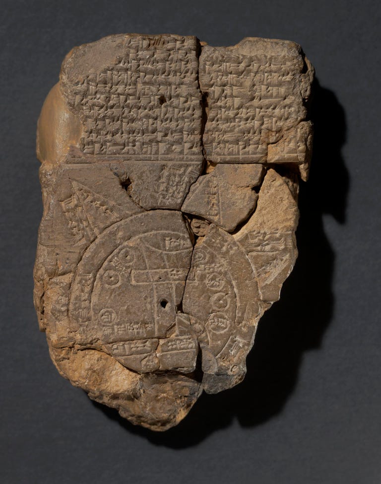
A clay tablet known as the Babylonian Map of the World, or Imago Mundi, is the oldest known map of the world. It was discovered in Iraq and dates back to about 600 B.C.

404485001
The Babylonian Map of the World is the oldest map of the world. The Trustees of the British Museum

Modern mapmaking got its start in 1852, when French army officer Aimé Laussedat created the first maps with photographs. Laussedat also experimented with aerial photography, sticking cameras on kites and balloons. As air travel became more sophisticated, aerial photography transitioned from balloons to planes in World War I and World War II and, eventually, to satellites in the 1970s. 

Nowadays, aerial photography is more automated than it was when ground crews launched unsteady balloons into the air, hoping to get the right shots. Hundreds or thousands of images are taken automatically from planes and satellites to make maps. Now planes and satellites visit the same place regularly, reliably showing how land changes over time.

“Land change is really complex. … Tying it to climate, I’m not sure we’re there yet,” says Jesslyn Brown, research geographer for the Earth Resources Observation and Science Center at the US Geological Survey. You can’t identify patterns that could point to climate change without monitoring the same places at regular intervals.

“This might be a little controversial, but my opinion is that governments don’t find monitoring very sexy,” Brown says. “But it’s an absolute necessity because you can’t manage what you can’t measure, so we need to take these measurements in order to have the information to monitor the Earth and to monitor the effects of climate change.”

Chasing change 

In the US, Landsat is the best-known Earth-observing satellite for monitoring and mapping purposes. Landsat 7 and Landsat 8 circle the globe once every 99 minutes, traveling at 17,000 miles per hour. Each satellite covers the entire planet in 16 days. Together, they cover the Earth in eight days because they’re in reverse orbit. 

The satellites are “roughly the size of a small school bus,” says Doucette, the USGS director who showed me the map of Washaway Beach, and have a 30-meter resolution, “about the size of a baseball diamond per pixel.”

Generations of Landsat satellites have been doing this since 1972. That 50-year record makes it extremely valuable for tracking changes over time.

“[50 years of data] provides researchers the ability to go back through time and monitor what kinds of changes are going on on the land surface,” Doucette says. “That really wasn’t possible until just the last five to 10 years with the big data compute capabilities that have become available.”

l9-himalaya-hyperwall-rgb-nolabels
This image of the Himalayan Mountains is one of the first shots taken by Landsat 9.  NASA

NASA launched its newest satellite, Landsat 9, on Sept. 27. Soon, it will hand over control of Landsat 9 to the USGS. Then, Landsat 7, which has been orbiting the planet for 22 years, will be retired. Most old Landsat satellites go into “disposal orbits,” destined to circle the planet until they eventually reenter the atmosphere and burn up. Landsat 7 won’t have the same fate; it will be moved into a different orbit to help test NASA’s robotic refueling project, Doucette explains. 

Landsat is still the gold standard for satellite imagery, says Terry Sohl, acting branch chief for the Integrated Science and Applications Branch and research scientist at the USGS Earth Resources Observation and Science Center. “To be honest, I’m not sure that’s going to be the case in five years,” Sohl adds.

Private satellite companies are making it easier than ever to visualize changes worldwide almost as soon as they happen for much less money than Landsat. 

Smaller, faster, cheaper, sharper

“If you’ve got a satellite right now that covers the Earth every two weeks, you can have homes and cities destroyed in that time,” says Tischler, the USGS director of the National Geospatial Program. Private companies are sending larger numbers of tiny satellites into orbit that cost less to build, launch and operate, have very high-resolution cameras and cover more ground more quickly. 

One of the private companies, Planet, has two different types of satellites: Dove and Sky satellites. The 180 Dove satellites are the size of a loaf of bread; they orbit the globe every 90 minutes and have a three- to five-meter resolution, or about 10 to 16 feet. 

Fifteen of the Sky satellites orbit at the poles like the Dove satellites. The remaining six Sky satellites orbit at latitudes closer to where people live to capture images of cities. Combined, the Sky satellites orbit Earth 12 times per day. Sky satellites are about the size of a dishwasher and have a resolution of just 50 centimeters, or a little over a foot and a half. They capture details that Landsat’s baseball-diamond-size resolutions can’t. 

Planet satellites show the Milne Ice Shelf breaking apart in July 2020. Planet Labs PBC

Smaller satellites are cheaper, too. It costs about a billion dollars to design, build, test and deploy one Landsat satellite. One Planet satellite costs in the “low hundreds of thousands of dollars,” although the company wouldn’t say exactly how much. 

Having a lot of smaller satellites also makes it easier for the San Francisco-based team to build them locally and experiment with new technologies quickly. 

“If there’s something new that comes to the market that could lead to better image quality … we have the option to just switch that out in-house where we’re actually building the satellites in the basement of our headquarters in San Francisco and just say, ‘Hey, let’s put in a new sensor. Let’s launch that,'” says Harrison, Planet’s director of science strategy. 

That way, if they want to test something, they can try it on one satellite and see how it works, without having to update all 200 satellites in their fleet.

Its various satellites have observed many events related to the climate crisis all over the world. The most significant changes they’ve seen have taken place in the coldest regions.

In July 2020, Planet satellites captured the collapse of the last intact Arctic ice shelf. “That was obviously a big tragedy. It’s not the kind of thing that you want to see, but it’s something that we managed to capture,” Harrison says.

Seeing is believing

Newer satellites are giving us more data, more quickly. Advancements in computing are changing how mapmakers use that data to show how our planet is changing right now and how it could change in the future.

Doucette is showing me another map now, this time a projection of what the land near Lubbock, Texas, will look like decades from now. At some point, the Ogallala Aquifer, which supports cotton and other key crops in the region, is going to dry up. Scientists at the USGS worked with other government agencies to create forecasts of Lubbock between 2014 and the end of the century, drawing from Landsat data, socio-economic data and climate data.

The map shows the cotton crop disappearing in tandem with the Ogallala’s water. The projections will vary based on how water usage continues, so scientists create best, middle and worst case scenarios because of the uncertainty. 

“Climate is actually much more predictable than people. I don’t worry about the variability in a climate scenario; I worry about the variability of how people behave,” says Sohl, the USGS scientist. “There are all these things that happen that are just so totally unpredictable, like a new government policy that can have a huge impact on the landscape.”

ogallala-changes-620
What happens when the Ogallala Aquifer runs out of water? NOAA

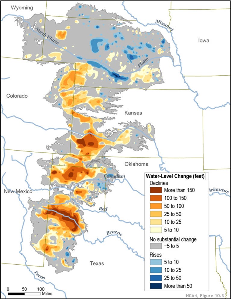
Either way, the Ogallala’s water will disappear and it isn’t coming back.

Knowing this in advance gives people in Lubbock time to shift to other types of crops that don’t depend so heavily on water. Doucette suggests dryland wheat or returning the area to grassland.

“This is how we hope to use Landsat and other related Earth observation data so we can understand the causes of change in the past that kind of help us develop these models for projecting potential change going into the future,” Doucette says. 

Historic data from Landsat combined with sharper-resolution imagery from private satellite companies equips mapmakers to show climate change impacts now and model what could happen to the same areas decades or even centuries from now. “[Landsat and private satellite companies] really [are] a nice mix of where we’re going in the future,” says Sohl.

As Washaway Beach’s erosion cuts further into inland Washington state, the freshwater cranberry bogs the area is known for are increasingly threatened with contamination from salt water. But with these technologies, scientists can look at the models and make decisions before Washaway Beach, the Ogallala Aquifer and other places like them fall off the map. 

“Imagine being able to do this kind of projection … and doing it on a national scale or even a global scale,” Doucette adds. “That’s our hope; this is still kind of cutting-edge research.” 

Um mapa do risco no mundo (Pesquisa Fapesp)

Com exceção do Japão, os países pobres e em desenvolvimento são os mais vulneráveis a desastres naturais 

MARCOS PIVETTA | ED. 249 | NOVEMBRO 2016

mapa
Por estar sujeito a fortes terremotos e inundações causadas por tsunamis, o Japão é o único país desenvolvido que apresenta risco muito alto de ser afetado por cataclismos, segundo a edição de 2016 do World Risk Report, publicação organizada pela Universidade das Nações Unidas, agência alemã Alliance Development Works e Universidade de Stuttgart. A nação asiática figura na 17ª posição do índice mundial de risco a desastres, que classifica 171 países em função da possibilidade de serem alvo de cinco tipos de eventos extremos: secas, inundações, ciclones ou tempestades, terremotos e aumento do nível do mar.

O índice lista as áreas do globo em ordem decrescente de vulnerabilidade a desastres e os separa em cinco categorias. Cada uma delas é composta por 20% do total de países, que são classificados como sendo de risco muito alto, alto, médio, baixo ou muito baixo. O indicador final é calculado por meio da análise de 28 parâmetros geoclimáticos e socioeconômicos, como a quantidade de pessoas expostas a desastres, a renda e a educação da população, a capacidade de mitigar o impacto de eventos extremos e de se adaptar a mudanças.

Vanuatu, um pequeno arquipélago do Pacífico sul distante 1.700 quilômetros a leste da Austrália, com 250 mil habitantes, é o país mais arriscado do mundo, o número 1 do índice. Está sujeito a terremotos, ciclones e pode ser coberto pelas águas se o nível do mar aumentar. Isso sem contar o vulcanismo, que não entra no cálculo do índice. O segundo lugar é ocupado por Tonga, um arquipélago da Polinésia, e o terceiro, pelas Filipinas. O Haiti, onde o furacão Matthew matou 1.300 pessoas e desalojou 35 mil em outubro, aparece em 21º lugar da lista. O Brasil ocupa a 123ª posição e está classificado na categoria dos países de baixo risco, como os Estados Unidos, a Itália, a Argentina e o Reino Unido. “Nenhum índice baseado em desastres naturais é perfeito”, comenta Lucí Hidalgo Nunes, da Unicamp. “De acordo com as variáveis usadas e o peso dado a elas, as classificações mudam. Mas, certamente, o Brasil não é um dos países em pior situação.”

Citizen science network produces accurate maps of atmospheric dust (Science Daily)

Date: October 27, 2014

Source: Leiden University

Summary: Measurements by thousands of citizen scientists in the Netherlands using their smartphones and the iSPEX add-on are delivering accurate data on dust particles in the atmosphere that add valuable information to professional measurements. The research team analyzed all measurements from three days in 2013 and combined them into unique maps of dust particles above the Netherlands. The results match and sometimes even exceed those of ground-based measurement networks and satellite instruments.

iSPEX map compiled from all iSPEX measurements performed in the Netherlands on July 8, 2013, between 14:00 and 21:00. Each blue dot represents one of the 6007 measurements that were submitted on that day. At each location on the map, the 50 nearest iSPEX measurements were averaged and converted to Aerosol Optical Thickness, a measure for the total amount of atmospheric particles. This map can be compared to the AOT data from the MODIS Aqua satellite, which flew over the Netherlands at 16:12 local time. The relatively high AOT values were caused by smoke clouds from forest fires in North America, which were blown over the Netherlands at an altitude of 2-4 km. In the course of the day, winds from the North brought clearer air to the northern provinces. Credit: Image courtesy of Leiden, Universiteit

Measurements by thousands of citizen scientists in the Netherlands using their smartphones and the iSPEX add-on are delivering accurate data on dust particles in the atmosphere that add valuable information to professional measurements. The iSPEX team, led by Frans Snik of Leiden University, analyzed all measurements from three days in 2013 and combined them into unique maps of dust particles above the Netherlands. The results match and sometimes even exceed those of ground-based measurement networks and satellite instruments.

The iSPEX maps achieve a spatial resolution as small as 2 kilometers whereas satellite data are much courser. They also fill in blind spots of established ground-based atmospheric measurement networks. The scientific article that presents these first results of the iSPEX project is being published in Geophysical Research Letters.

The iSPEX team developed a new atmospheric measurement method in the form of a low-cost add-on for smartphone cameras. The iSPEX app instructs participants to scan the blue sky while the phone’s built-in camera takes pictures through the add-on. The photos record both the spectrum and the linear polarization of the sunlight that is scattered by suspended dust particles, and thus contain information about the properties of these particles. While such properties are difficult to measure, much better knowledge on atmospheric particles is needed to understand their effects on health, climate and air traffic.

Thousands of participants performed iSPEX measurements throughout the Netherlands on three cloud-free days in 2013. This large-scale citizen science experiment allowed the iSPEX team to verify the reliability of this new measurement method.

After a rigorous quality assessment of each submitted data point, measurements recorded in specific areas within a limited amount of time are averaged to obtain sufficient accuracy. Subsequently the data are converted to Aerosol Optical Thickness (AOT), which is a standardized quantity related to the total amount of atmospheric particles. The iSPEX AOT data match comparable data from satellites and the AERONET ground station at Cabauw, the Netherlands. In areas with sufficiently high measurement densities, the iSPEX maps can even discern smaller details than satellite data.

Team leader Snik: “This proves that our new measurement method works. But the great strength of iSPEX is the measurement philosophy: the establishment of a citizen science network of thousands of enthusiastic volunteers who actively carry out outdoor measurements. In this way, we can collect valuable information about atmospheric particles on locations and/or at times that are not covered by professional equipment. These results are even more accurate than we had hoped, and give rise to further research and development. We are currently investigating to what extent we can extract more information about atmospheric particles from the iSPEX data, like their sizes and compositions. And of course, we want to organize many more measurement days.”

With the help of a grant that supports public activities in Europe during the International Year of Light 2015, the iSPEX team is now preparing for the international expansion of the project. This expansion provides opportunities for national and international parties to join the project. Snik: “Our final goal is to establish a global network of citizen scientists who all contribute measurements to study the sources and societal effects of polluting atmospheric particles.”


Journal Reference:

  1. Frans Snik, Jeroen H. H. Rietjens, Arnoud Apituley, Hester Volten, Bas Mijling, Antonio Di Noia, Stephanie Heikamp, Ritse C. Heinsbroek, Otto P. Hasekamp, J. Martijn Smit, Jan Vonk, Daphne M. Stam, Gerard van Harten, Jozua de Boer, Christoph U. Keller. Mapping atmospheric aerosols with a citizen science network of smartphone spectropolarimeters. Geophysical Research Letters, 2014; DOI: 10.1002/2014GL061462

Map reveals worldwide impacts of climate change (Science Daily)

Date: July 17, 2014

Source: University of Southampton

Summary: A new map, which shows the impact climate change could have on the whole planet by the end of the century if carbon emissions continue to increase, has been developed by scientists. Temperatures on the warmest days of the year are rising by 6°C or more across Europe, parts of Asia and part of North America, it shows. Also an increase in risk of flooding across 70 per cent of Asia, and the number of days of drought increasing in parts of South America, Australia and Southern Africa are illuminated by the new map.

Scientists from the University of Southampton have helped to create a new map, which shows the impact climate change could have on the whole planet by the end of the century, if carbon emissions continue to increase.

The Human Dynamics of Climate Change map, launched at the Foreign and Commonwealth Office was developed by the Met Office Hadley Centre with specific contributions from universities, Government and science organisations.

The map shows a range of potential impacts:

  • Temperatures on the warmest days of the year rising by 6°C or more across Europe, parts of Asia and part of North America
  • An increase in risk of flooding across 70 per cent of Asia
  • The number of days of drought going up by more than 20 per cent in parts of South America, Australia and Southern Africa
  • Maize yields falling by up to 12 per cent in Central America
  • Sea temperatures rising by up to 4°C in some parts of the world
  • Millions of people flooded due to sea level rise, particularly in East, Southeast and South Asia

The map illustrates how climate change could affect the global economy as regions connected by trade are affected by changes in crop yield, droughts, flooding and high temperatures. It also shows how many already water-stressed regions of the world could face an increase in the frequency and duration of droughts, at the same time as an increase in demand for water for agriculture and for the consumption of a growing population.

Professor Robert Nicholls and Dr Sally Brown, from Engineering and the Environment at the University of Southampton, contributed data and research which shows the number of people in coastal regions around the world that could potentially be flooded in the future as sea levels rise.

Dr Brown says: “We know that rising sea levels are already having profound impacts in many parts of the world. We hope that this tool will help scientists, policy makers and governments better understand the threat that climate change poses to our collective future prosperity and security and what actions are needed.”

Foreign Office Minister, Mark Simmonds said: “This map shows how the impacts of climate change on one part of the world will affect countries in other parts of the world, particularly through the global trade in food. This reinforces the point that climate change is a global problem: no country is immune, and we all need to work together to reduce the risks to our shared prosperity and security.”

Dame Julia Slingo, the Met Office Chief Scientist, said: “We’ve used the latest science to assess how potential changes in our climate will impact people around the world. This map presents that information together for the first time. While we see both positive and negative impacts, the risks vastly outweigh any potential opportunities.”

The map can be viewed at: http://www.metoffice.gov.uk/human-dynamics

The Map Of Native American Tribes You’ve Never Seen Before (Code Switch/NPR)

June 24, 2014 4:03 PM ET
Aaron Carapella, a self-taught mapmaker in Warner, Okla., has designed a map of Native American tribes showing their locations before first contact with Europeans.

Aaron Carapella, a self-taught mapmaker in Warner, Okla., has designed a map of Native American tribes showing their locations before first contact with Europeans.

Hansi Lo Wang/NPR

Finding an address on a map can be taken for granted in the age of GPS and smartphones. But centuries of forced relocation, disease and genocide have made it difficult to find where many Native American tribes once lived.

Aaron Carapella, a self-taught mapmaker in Warner, Okla., has pinpointed the locations and original names of hundreds of American Indian nations before their first contact with Europeans.

As a teenager, Carapella says he could never get his hands on a continental U.S. map like this, depicting more than 600 tribes — many now forgotten and lost to history. Now, the 34-year-old designs and sells maps as large as 3 by 4 feet with the names of tribes hovering over land they once occupied.

Carapella has designed maps of Canada and the continental U.S. showing the original locations and names of Native American tribes. View the full map (PDF).

Carapella has designed maps of Canada and the continental U.S. showing the original locations and names of Native American tribes. View the full map (PDF).

Courtesy of Aaron Carapella

“I think a lot of people get blown away by, ‘Wow, there were a lot of tribes, and they covered the whole country!’ You know, this is Indian land,” says Carapella, who calls himself a “mixed-blood Cherokee” and lives in a ranch house within the jurisdiction of the Cherokee Nation.

For more than a decade, he consulted history books and library archives, called up tribal members and visited reservations as part of research for his map project, which began as pencil-marked poster boards on his bedroom wall. So far, he has designed maps of the continental U.S., Canada and Mexico. A map of Alaska is currently in the works.

What makes Carapella’s maps distinctive is their display of both the original and commonly known names of Native American tribes, according to Doug Herman, senior geographer at the Smithsonian National Museum of the American Indian in Washington, D.C.

This map of Mexico features both the original and commonly known names of some indigenous nations. View the full map (PDF).

This map of Mexico features both the original and commonly known names of some indigenous nations. View the full map (PDF).

Courtesy of Aaron Carapella

“You can look at [Carapella’s] map, and you can sort of get it immediately,” Herman says. “This is Indian Country, and it’s not the Indian Country that I thought it was because all these names are different.”

He adds that some Native American groups got stuck with names chosen arbitrarily by European settlers. They were often derogatory names other tribes used to describe their rivals. For example, “Comanche” is derived from a word in Ute meaning “anyone who wants to fight me all the time,” according to the Encyclopaedia Britannica.

“It’s like having a map of North America where the United States is labeled ‘gringos’ and Mexico is labeled ‘wetbacks,’ ” Herman says. “Naming is an exercise in power. Whether you’re naming places or naming peoples, you are therefore asserting a power of sort of establishing what is reality and what is not.”

Look at a map of Native American territory today, and you’ll see tiny islands of reservation and trust land engulfed by acres upon acres ceded by treaty or taken by force. Carapella’s maps serve as a reminder that the population of the American countryside stretches back long before 1776 and 1492.

Carapella describes himself as a former “radical youngster” who used to lead protests against Columbus Day observances and supported other Native American causes. He says he now sees his mapmaking as another way to change perceptions in the U.S.

“This isn’t really a protest,” he explains. “But it’s a way to convey the truth in a different way.”

Take a closer look at Aaron Carapella’s map of the continental U.S. and Canada and his map of Mexico. He sells prints on his website.

Map of most influential environmental justice conflicts in the US is released this week (EJOLT Project)

UScases [BRUSSELS, 25 June 2014] The 40 most influential environmental justice conflicts in recent American history are now included in a Global Atlas of Environmental Justice. The U.S. cases were compiled by the University of Michigan’s School of Natural Resources and Environment. The interactive atlas is a product of the EJOLT project (Environmental Justice Organizations, Liabilities and Trade), which brings together dozens of universities and environmental justice organizations from four continents.

In the United States, decades of research have documented a strong correlation between the location of environmental burdens and the racial/ethnic background of the most impacted residents. In an effort to choose landmark cases in the U.S. the team from University of Michigan elicited feedback from more than 200 environmental justice leaders, activists, and scholars in identifying these case studies. “We felt that we could not identify influential cases without incorporating the voices of the activists and leaders who have worked within the field for more than three decades” says Alejandro Colsa-Perez, a Fulbright scholar from Spain and one of the four students from the team that recently graduated from the University of Michigan while doing the research on the top forty environmental justice cases.

Fossil fuels and climate justice conflicts; industrial conflicts and waste management conflicts dominate the list of most influential environmental justice conflicts, with seven cases each. The list includes historical cases within the environmental justice movement, such as 1978 Love Canal, New York, and the 1982 Warren County, North Carolina, protests. With the inclusion of tragedies like Hurricane Sandy and Hurricane Katrina, it is becoming clear that climate change threats are also disproportionately impacting the same communities that have suffered historically from environmental racism. The forty cases identified by participants in the survey represent a wide range of time periods, geographic regions, communities, and environmental challenges.

Although some of the cases have a clear ending point, many of these conflicts are ongoing and unresolved. An element of hope arises when looking at the percentage of conflicts where EJOLT collaborators believe environmental justice has been served, based on the way the conflict was resolved or on the improvements that impacted communities have achieved in their fight against injustices (e.g. the existence of compensation to communities, court cases in favor of environmental justice communities, rehabilitation/restoration of the area, or strengthening of participation in decision-making). As judged by the EJOLT team, in the U.S. approximately 35% have experienced some form of environmental justice success, compared to an average of 17% worldwide. “The long history of environmental justice activism in the United States can provide an important guide for activists and researchers across the Globe to learn about strategies that vulnerable communities have used in the past to help improve conditions within their communities”, says Professor Paul Mohai from the School of Natural Resources and Environment at the University of Michigan.

The Global Atlas already has over 1100 stories about communities struggling for environmental justice. It serves as a virtual space for those working on environmental justice issues to get information, find other groups working on related issues, and increase the visibility of environmental conflicts. According to Atlas coordinator Leah Temper from the Autonomous University of Barcelona “only once communities stand up and say we will no longer be polluted, will governments and companies change their behaviour”.